 ← All work
Start a project
← All work
Start a project
Case study · Full brand launch · 2026
A concept electrolyte drink, launched like a real one. Brand, online store, product page, a 15-second AI commercial and the email flows, all made by one person in one look, so every touchpoint feels like the same brand.
Salt, not sugar. A loud italic wordmark, one deep blood-red base and a colour per flavour, so a can is recognisable from across a shop.
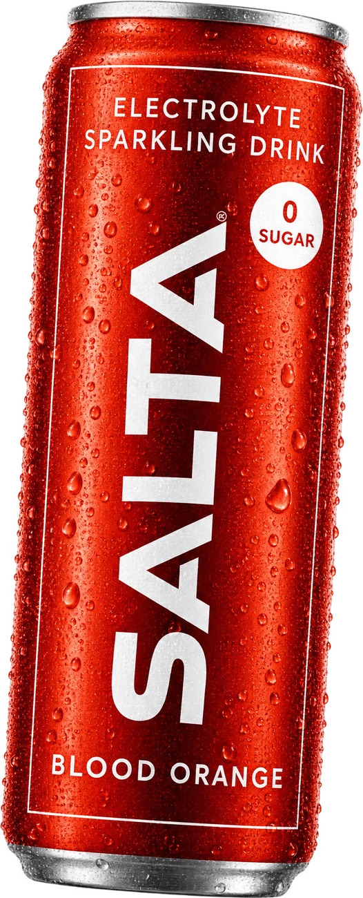
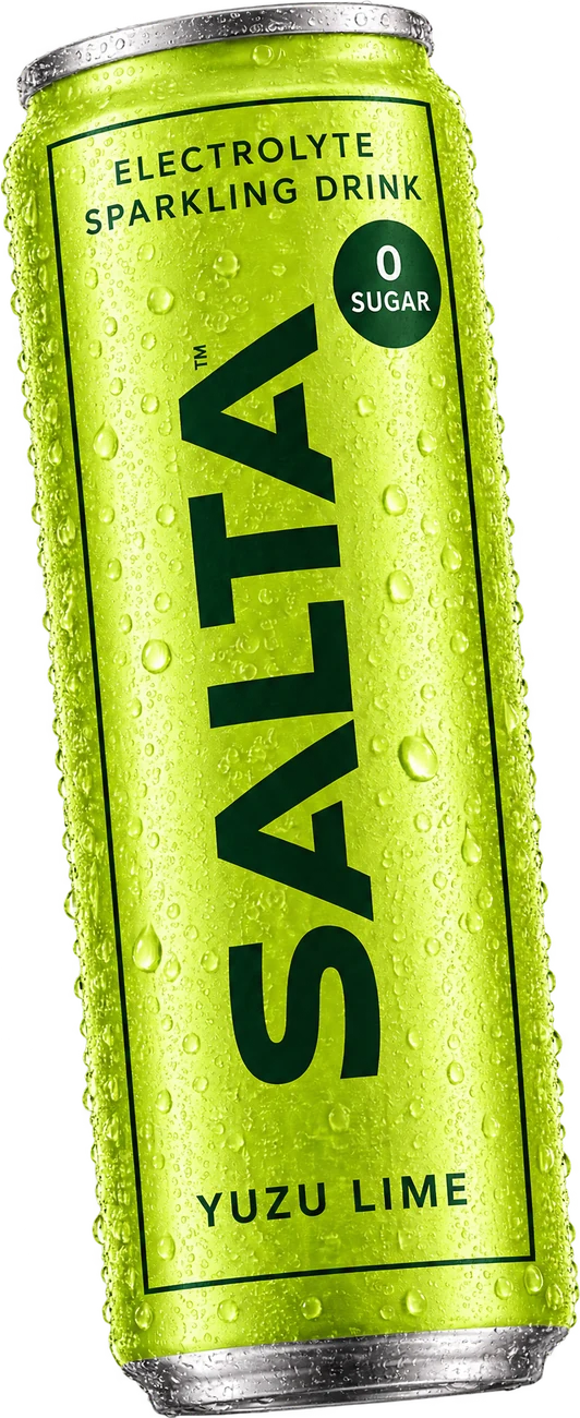
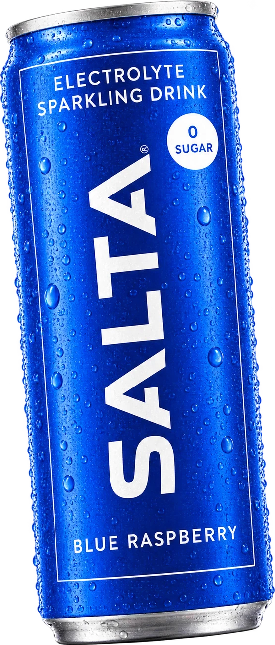
Salt,
not sugar.
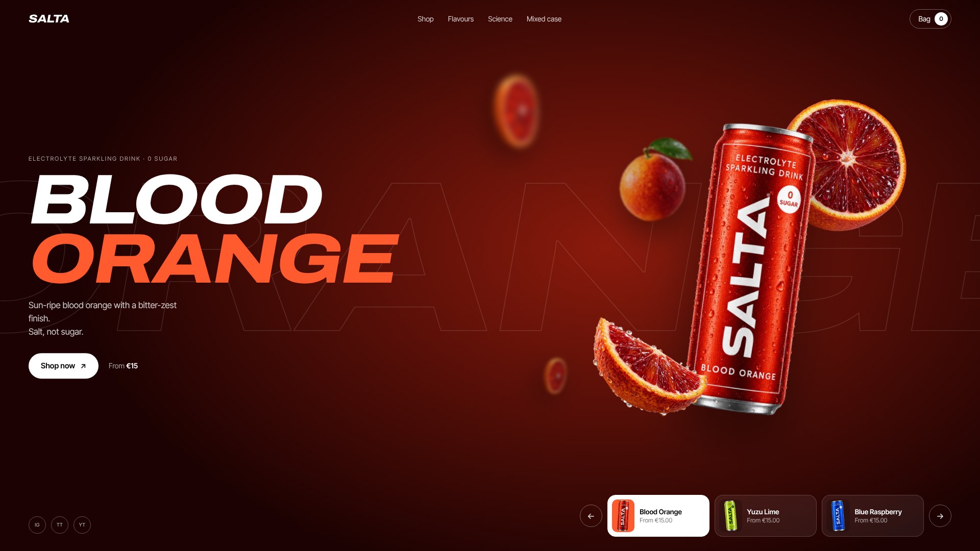
A scroll-driven 3D can that leans into the page, three flavour stories and a bag that works. Built to sell the first case.
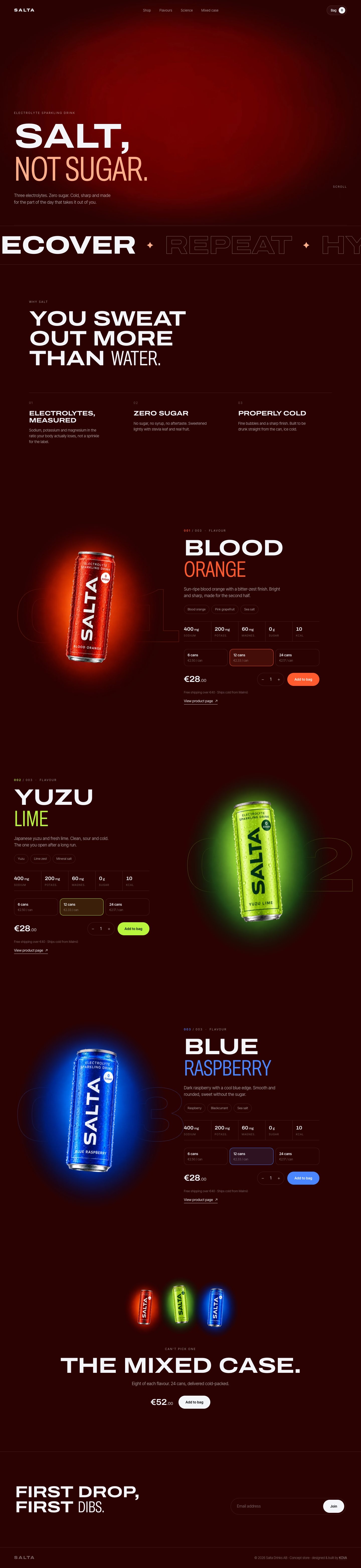
Pick a flavour and the whole page sweeps to its colour. Packs, subscribe and save, nutrition, all one tap from the can.
15 seconds, built to stop the scroll: a cold open mid-burst, the sealed can, then salt instead of sugar exploding out of it. Every spec on screen comes straight from the can.
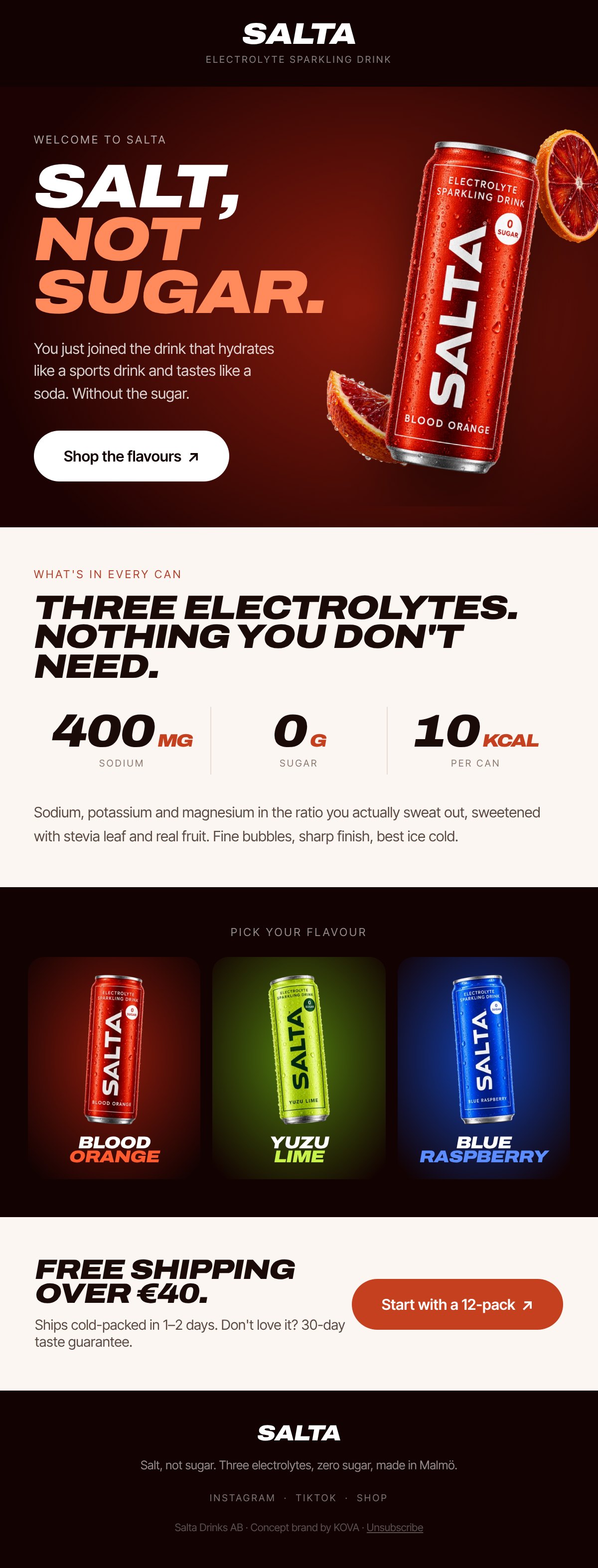
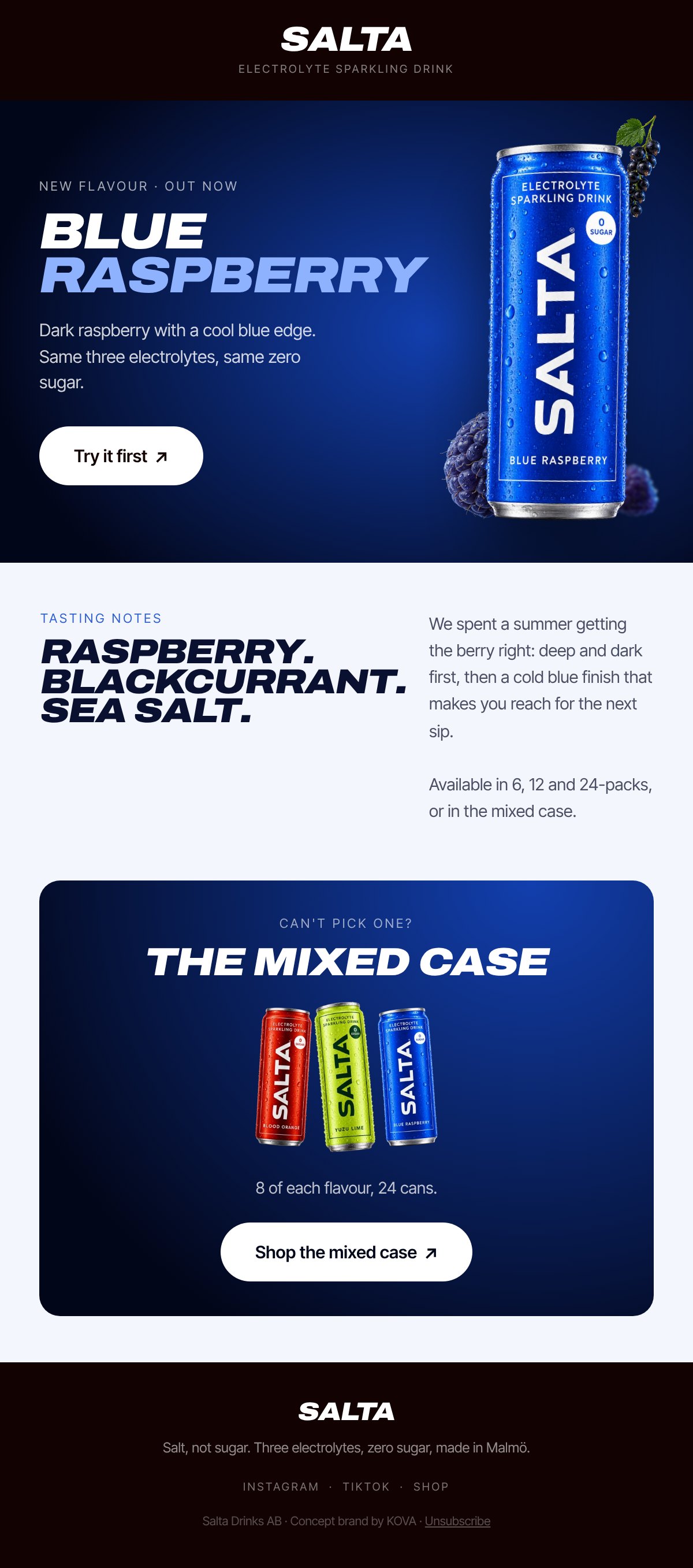
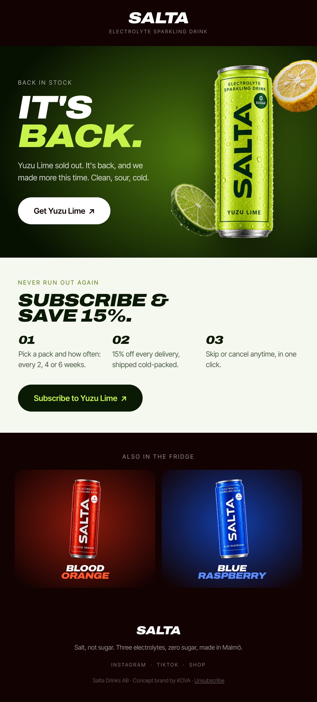
The flows that turn a first visit into a habit, designed in the same look as the store. Scroll inside each phone.
Your brand next
SALTA is a concept brand made by KOVA to show the full process. Not a real product.